

Eco.Logic Overview
The Challenge
Tools utilized on this project


My team and I redesigned Eco.Logic’s website. Eco.Logic is an amazing environmental action organization that inspires engagement through creative and education initiatives.
Unfortunately, users weren’t sure what Eco.Logic’s mission was or how to get involved. In our audit, we discovered that we needed to tell the organization’s story and provide clear calls to action by restructuring the layout and navigation. Our redesign showcases a mature and inspiring climate action organization. As a result we increased user satisfaction from 27% to 93%.
Our design team was dynamic. While we each had assigned roles we all contributed to every part of the project.
Problem
Environmental activists have trouble understanding Eco.Logic’s mission and engagement opportunities because the navigation and layout make it difficult to understand.
Solution
Restructure Eco.Logic’s website navigation so that users can quickly understand who the organization is and how they can engage in initiatives.
My Role
I led the research:
Selected research methods and planned the timeline
Delegated tasks, conducted research, and synthesized the data
Presented research findings to our client, Eco.Logic
I also assisted teammates with tasks such as developing test plan and SOW, sketching, wireframing, and site page building.
Research Overview
Client Goals
Founder and Executive Director, Rozina Kanchwala asked our team to:
“Revamp” the homepage now that the mission is becoming more clear and the organization is more established
“Showcase Eco.Logic’s impact to establish legitimacy as a more seasoned organization”
Design a site that is more “clear” and “clean”
I took a holistic approach to research so that my team could design for user needs and the best website layout to meet Eco.Logics goals. For the purpose of this case study I will speak to the research highlights. The full list of methods is listed below.
What Our Design Team Found
Eco.Logic’s site navigation and mission needed to tell a more clear story.
Eco.Logic was still trying to figure out their audience and organization goals
Users weren’t clear about the mission and had trouble completing user tasks
The information architecture and navigation contributed to a disjointed organization narrative
Research Methods
usability tests | client and board member interviews | persona development | Squarespace Analytics
comparative analysis with feature inventory | open and closed card sorts | userflows
Identifying the Problem


We learned that Eco.Logic is still shaping their identity during stakeholder interviews. This was evident in the original site design.
Still finding programming direction
Everyone is the target audience
Usability tests of the original site revealed user confusion with Eco.Logic’s mission and navigation.
In addition to Eco.Logic’s goals for the redesign our team considered how we might:
Clarify the organization’s purpose upon first impression to promote interest, trust, and clarity
Restructure the bits of navigation that were confusing to users and add more prominent calls to action
Honor the spirit of the organization and promote the content that users connected to on the original site

Usability Test - Growth Area Results

Usability Tests Takeaways
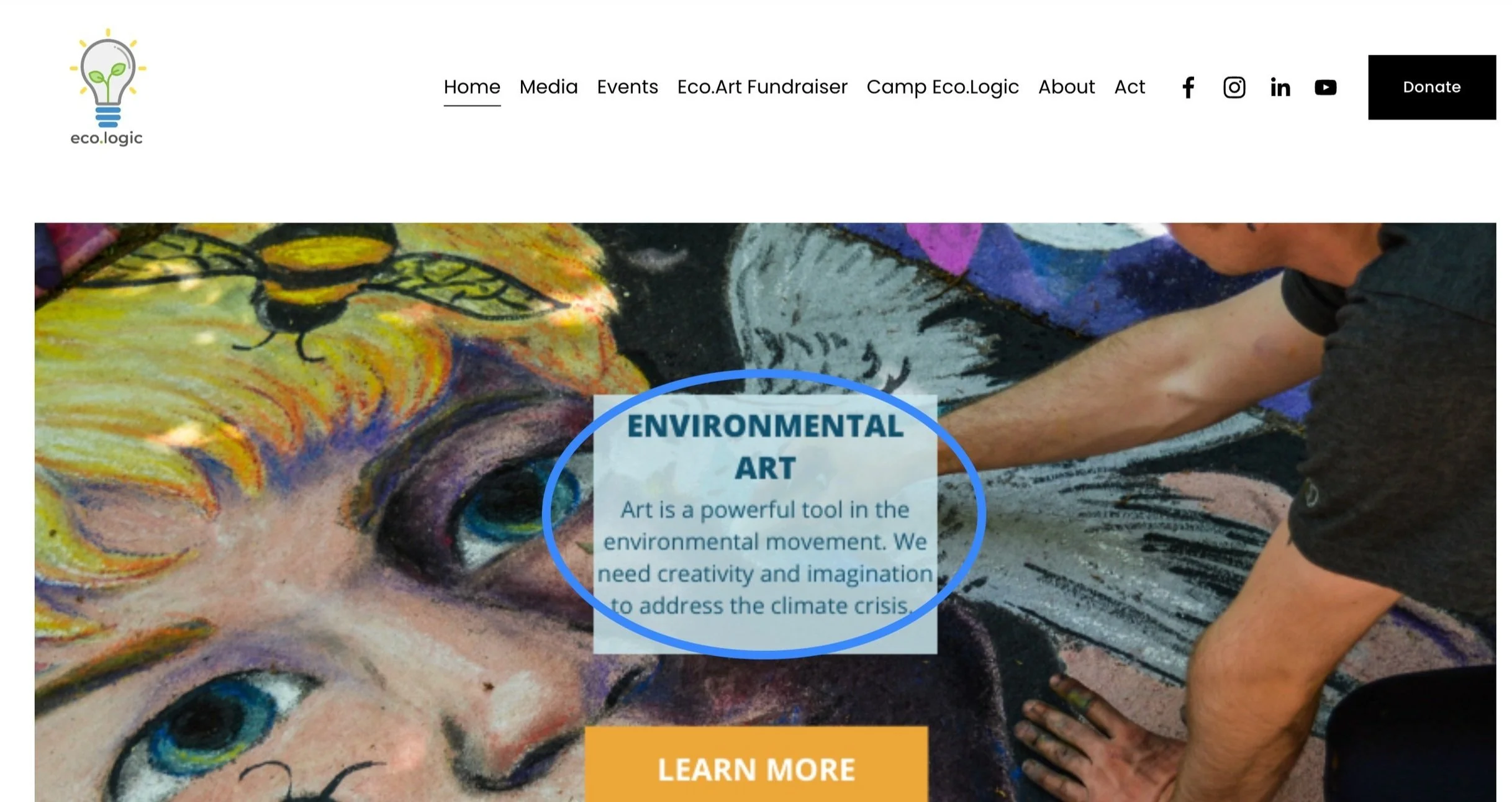
Users didn’t have a clear first impression of the organization because of the initial text and image
Users thought Eco.Logic was an organization for environmental arts because it was the first thing that they saw
Users had difficulty completing tasks. The important items weren’t prioritized in the navigation and there weren’t clear calls to action.
It took too long to find the Act button - a key component of the site
Once users found out how to take action they didn’t realize they could click on the images to get more information

Users asked for more information before donating to Eco.Logic.
Users hadn’t built enough trust navigating the rest of the site
Users missed the information stated on Eco.Logic’s original site due to competing visuals

A Closer Look at Growth Areas


Understanding an audience with different interests
Eco.Logic has diverse programming so it was critical to keep their audience in mind as we developed navigation options. We designed and validated personas through:
Studying the original site’s Squarespace Analytics
Meeting with the organization’s founder and board member
Reviewing the organization’s program offerings
Below are two samples from the personas we referenced throughout our design process to keep user needs in mind.


Solving for Eco.Logic’s Users
Utilizing these personas throughout the research and design process helped keep us focused on who we were designing for.
Eco.Logic users have varying income levels - some can contribute while others need sponsorship
Eco.Logic users have diverse programs of interest
Users are unified by their interest in climate action and Eco.Logic’s opportunities for engagement
Researching a Solution
Cart sort results helped us determined the categories for the redesigned global navigation
We studied Eco.Logic’s website and found 33 items from their global navigation. We asked users to sort the items into categories so we could see how they organically grouped them. We took that research and came up with 3 final categories based on their groupings
Take Action
Our Work
About Us
We validated those results with a closed cart sort. Users were given the three categories and asked to group the 33 items under the categories.
Results Analysis
Data confirmed the categories were intuitive and predictable
We were surprised that 50% of users group Art Initiatives under Our Work
We made the decision to group Art Initiatives under Take Action due to the nature of the content and to keep it consistent with Education Initiatives
We walked away with the final navigation terms of
Take action
Our Work
About

Comparative analysis helped inform our design choices to make the mission more prominent and clear.
We studied the features that similar organizations had on their sites with a focus on structure and layout. This helped us prioritize where and how to place Eco.Logic’s language to provide a clear first impression of the organization.

Building the New Design
We reviewed our research findings and Eco.Logic’s goals to develop a revamped site that would represent the organization’s story and offerings in a more usable and updated redesign.
Developing a mood board and style guide aligned our design vision as a team

We selected an excerpt from the mission statement and placed it prominently on the homepage (based on comparative analysis research) in order to give users a more clear first impression of Eco.Logic
We emphasized things like the organization’s name and donate button by increasing size and adding eye catching color
We updated the navigation to make it more simple than the original site

Reorganizing the navigation options further helped users find ways to take action and locate pertinent information
Programs were shown in several places. Users found them in the global navigation, under Act, and under the About section under Initiatives.
On the programs page users didn’t realize they could click on the pictures to learn more
It wasn’t always evident to users how they could interact and engage once they found the programs
We developed an Our Programs page with clear calls to action which you can view in the
When possible we used Eco.Logic’s original language and photos


Strategically placing elements emphasized the key features users looked for most
Eco.Logic provided a logo, font and color palette.
We developed the design further by creating a clean, positive, friendly, and informative.
We replaced certain images with higher quality photos when needed. However, we wanted to honor the identity of the organization so we used original art work and event photos whenever possible to tell an authentic story with true representation.


Every design decision was made with our goal in mind to restructure Eco.Logic’s website navigation to provide more concise clarity to users about who the organization is and how potential activists can engage in initiatives and programming.
Usability tests on the new design revealed 72% growth in user satisfaction and navigation success
Users immediately identified the organization's mission and purpose.

Users found opportunities for action and engagement with ease in the new design

Users learned about donations and sponsorships in the new design

Our goal was to restructure Eco.Logic’s website navigation to provide more clarity to users about the organization and how potential activists can engage in initiatives. And incorporate Eco.Logic’s goals.
“They are getting people involved in environmental action and they're trying to do it through many different ways...like through education and the arts.”
User testers located ways to get involved immediately without click errors and without expressing frustration.
Every user except one felt that they had enough information to move forward with the giving process confidently.
Testing Our New Design - Usability Research Results
Research Based Revisions to Our Design

Redesign Item 1

Redesign Item 2
Some users didn’t realize the page scrolled.
We adjusted the spacing between the introduction banner and content of each page to help users understand they could scroll by revealing words from the next section.
Some users said that they were drawn into the pictures rather than the information about the programs. We reorganized our program cards to emphasize the title rather than the image for ease of understanding.
Next Steps
While we would have loved to do more we were limited by time constraints and the functionality within Squarespace without a coder. We recommend the following next steps.
Adjust the formatting for a mobile friendly version
Add breadcrumbs to help users know where they are within the site
Refine the donation page. We provided a high fidelity mock up but were unable to make changes to this page to account ownership.
Continue to test the website
Reflections
Working with Eco.Logic on their website was a dream project. We made design improvements for an organization committed to improving environmental action.
Our team wasn’t always on the same page about designs. We skipped the best practice of sketching and sharing out with the team for each page design. Because we had the style guide and discussed our ideas we thought we were had the same idea. We ended up needing to spend extra time in Squarespace to correct and align or designs which took more time. Sketching and sharing frequently is key to making sure a team stays on the same page and works efficiently in the long run. I wished that we had done it differently by sketching on paper or brainstorming wireframes in Figma first.